
The first few pages of your Shelf Report give a quick high-level overview.
The Cover Page shows a quick, basic view of the 4 Shelf Report Measures, their current score, and any change since your last report for your entire store (books only):
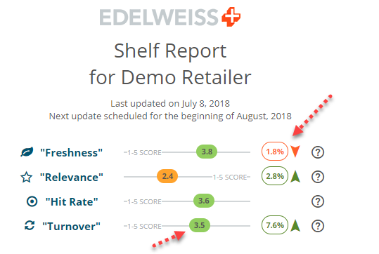
In the case shown above, this store’s Freshness score has dropped 1.8% since the last report, but the Turnover score has jumped 7.6%.
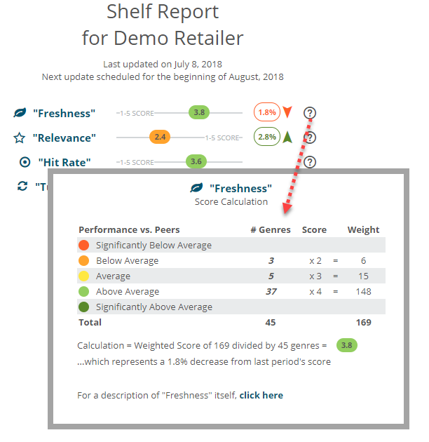
Click the ? icon next to each measure to see details about how that score was calculated:
Top 15 Lists:
Of the 44 genre classifications listed in the Shelf Report, this page will show you your 15 top-performing, and the 15 worst-performing categories, based on the 4 measures found throughout the report.
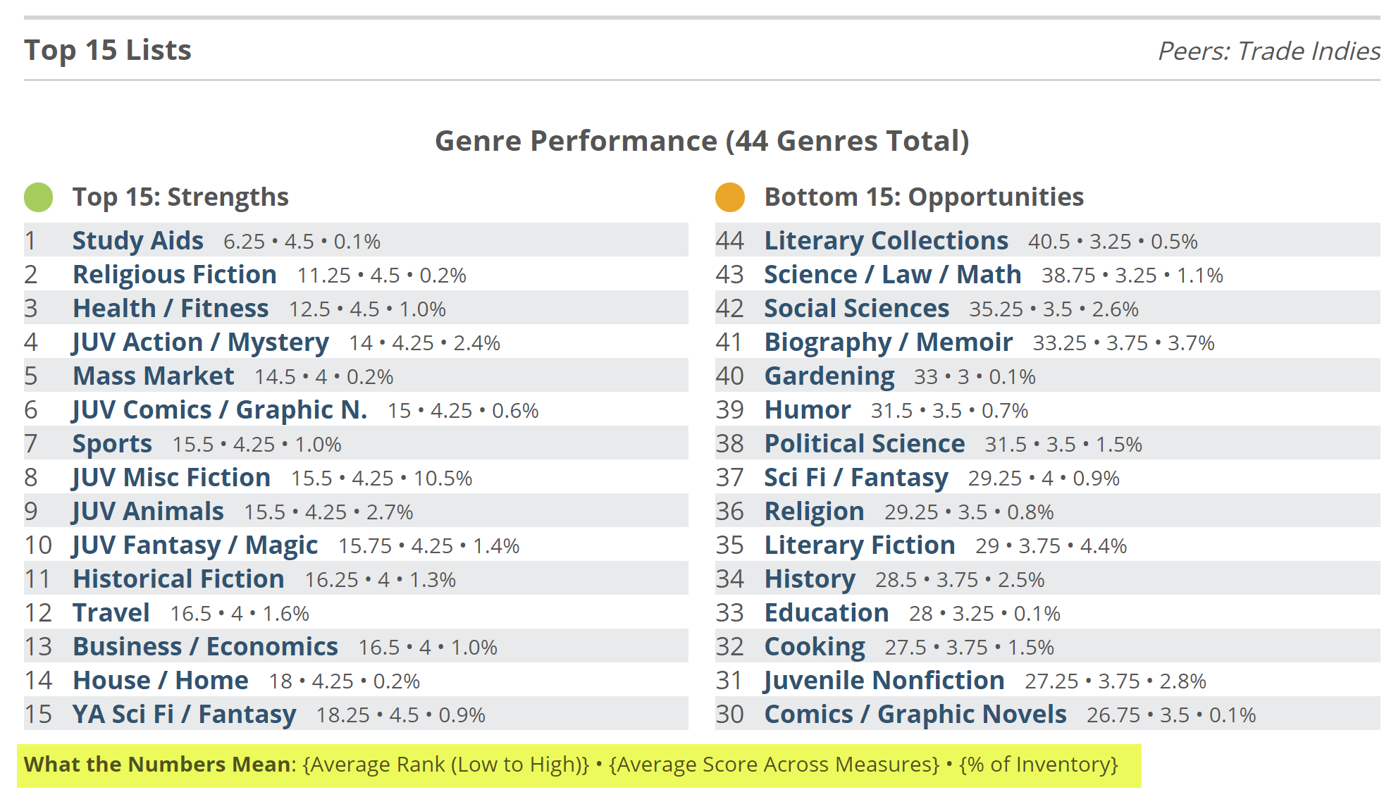
Click on a category/genre to see its Genre Detail page.
Dashboard:
The Dashboard page shows a pie graph for each of the 4 Shelf Report measures, indicating how the various genres perform within that specific measure.
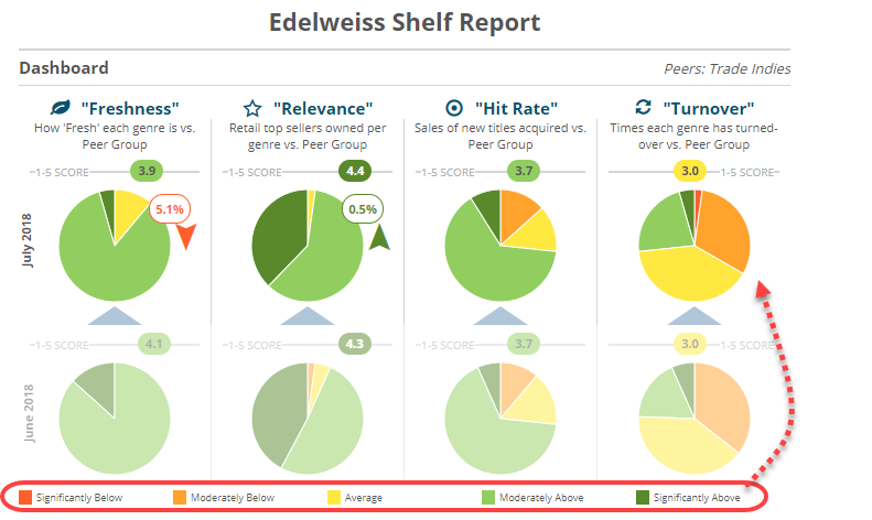
In the image above, you can see that for the Turnover graph, most genres at this store have turns that are “Average” or “Moderately Below” average. Click on a graph to see how each specific genre is performing, in the Genre Assessment pages:
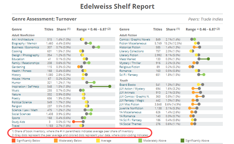 Note that the gray dots indicate the market average for that genre, while the numbers in parenthesis under Share indicate the percentage of inventory the average store dedicates to that genre. So you can get an overall view of your inventory, click through to get a more granular view, and then advance to the next pages to dive in ever deeper.