
The purpose of the Category Performance Comparison lane is to give you a tool with which you can compare your different categories to each other to see which are performing the best, or worst, or that may be just as they need to be. The idea is to help you prioritize those areas of your shop that might need more immediate attention, whether with an influx of titles, or (most often) the opposite.
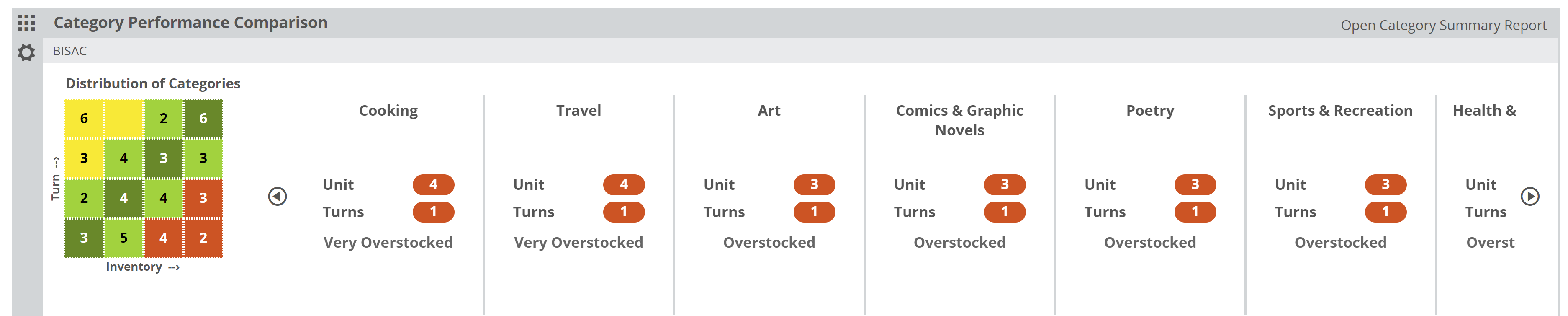
Keep in mind, that these comparisons are ‘relative,’ meaning that this tool compares your categories to each other, rather than to some subjective ‘ideal’ performance. It measures each category according to turn vs. inventory…so it essentially asks the question: “Is this category sized according to its performance?” To provide an example: If your gardening category makes up 40% of your inventory in your shop, but only accounts for 5% of your sales… that category is grossly over-sized.
Categories that would be considered “Overstocked” show up in the red portion of the graph. Those categories listed in the yellow portion of the graph would be considered “Understocked.” For example, if your Self-Help section accounts for 5% of your stock, but accounts for 20% of your sales, there’s a good chance that Self-Help (and your bottom line) would benefit from more space and more books for that category. Those categories that show in green are closer to being ‘balanced,’ in that their size is commensurate with their sales.
Within the graph, your larger categories are on the far right, and smaller categories are on the left.
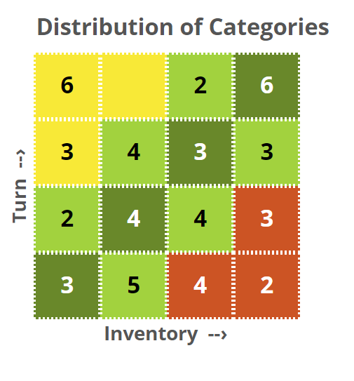
On the vertical axis, your best-turning categories are at the top, with your slowest-turning categories on the bottom row. The numbers indicate the number of categories contained in each section of the graph.
The categories listed in the upper right are basically your largest and best-selling categories…arguably the categories that are keeping your doors open. Those in the lower right (in the red) are those that are potentially dragging you down. One can assume that the person responsible for purchasing at this shop assumes that those categories are popular and have stocked them accordingly. Data suggests otherwise, however.
You can view your inventory through a few different ‘lenses.’ The most obvious would be your own POS categories. This references the categories Edelweiss Analytics receives via the feed from your Point-of-Sale system.

You can also use BISAC (or BIC in the UK), Dewey, Age, Media Type (format), etc. Most of that information, like format, Ag, BIC (or BISAC) subject, etc. are all provided within the publishers’ metadata for each title. So, regardless of how you classify a title in your store, you can still see how your stock is portioned out according to, for example, fiction genres:
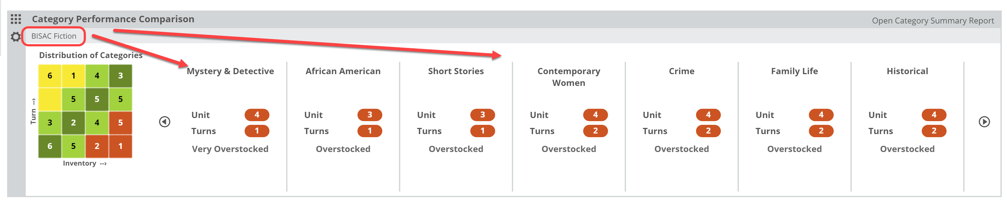
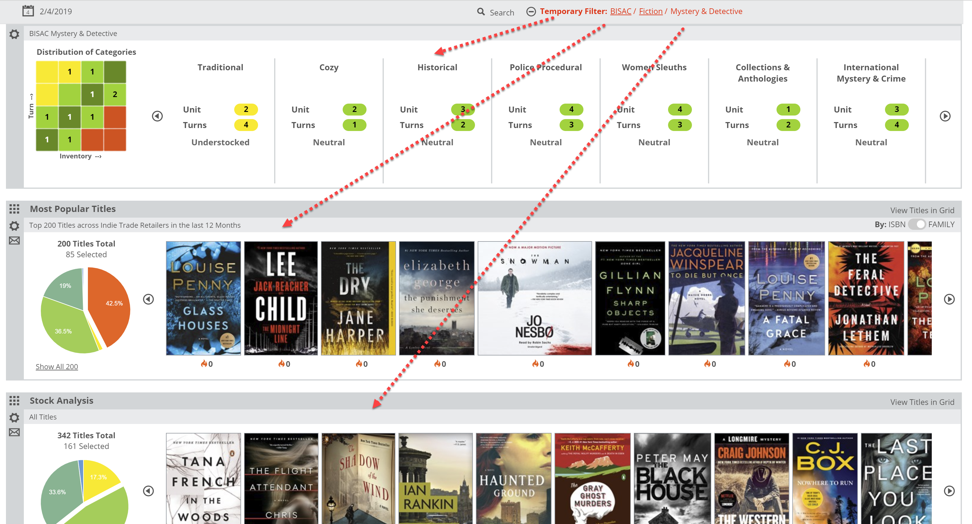
Or you can even see how, for example, which ‘sub-genres’ of Mystery titles you tend to stock and sell the best, or worst. To do so, in the image above you would simply click on “Mystery & Detective” to open that category.
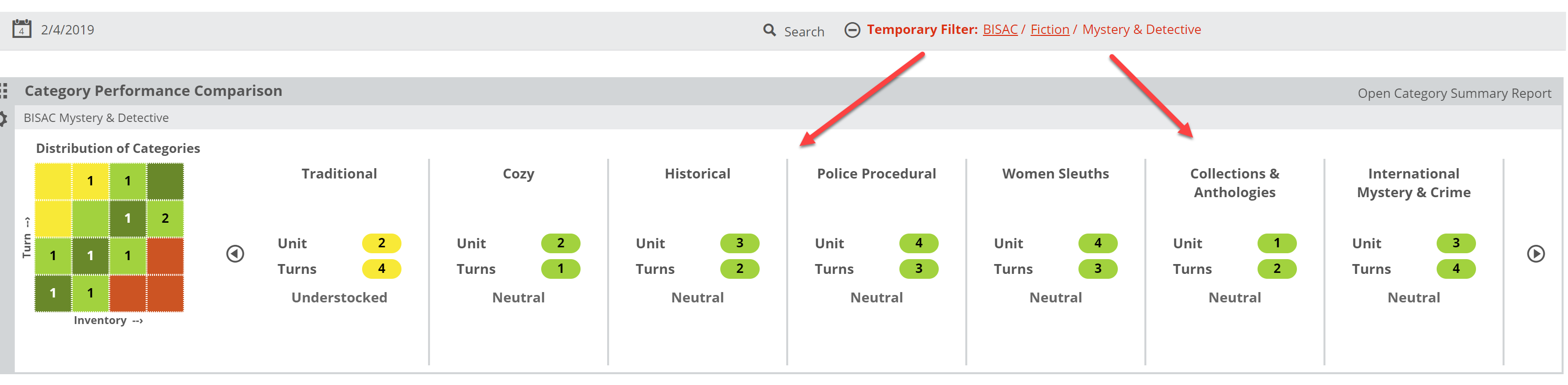
Note that this creates a “Temporary Filter” that is applied to your other Analytics Lanes. So, you can dive in to your mysteries and immediately research what you might be missing, what could/should be returned, upcoming titles, etc.
You can also get more detail about the performance and such for these categories. By clicking “Open Category Summary Report.”