Once you’ve used the Category Performance Comparison graph to get a view of categories for which you’d like to see more detail, click “Open Category Summary Report:”
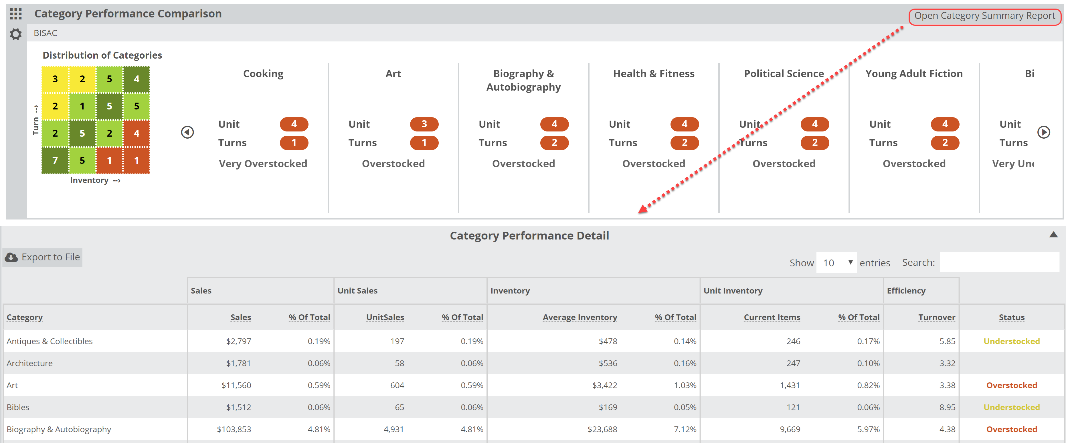
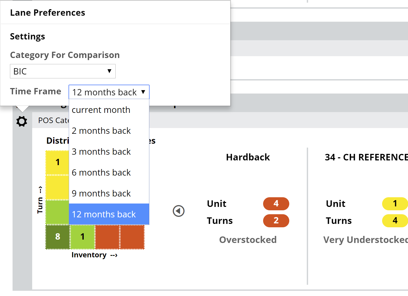
You’ll see a detailed breakdown of the current category selections, broken down according to Sales, Inventory Size, and Annual Turnover. Keep in mind that the information provided in this chart will be based on the Time Frame and Category for Comparison you select in your filter parameters here:
The chart will look like so:
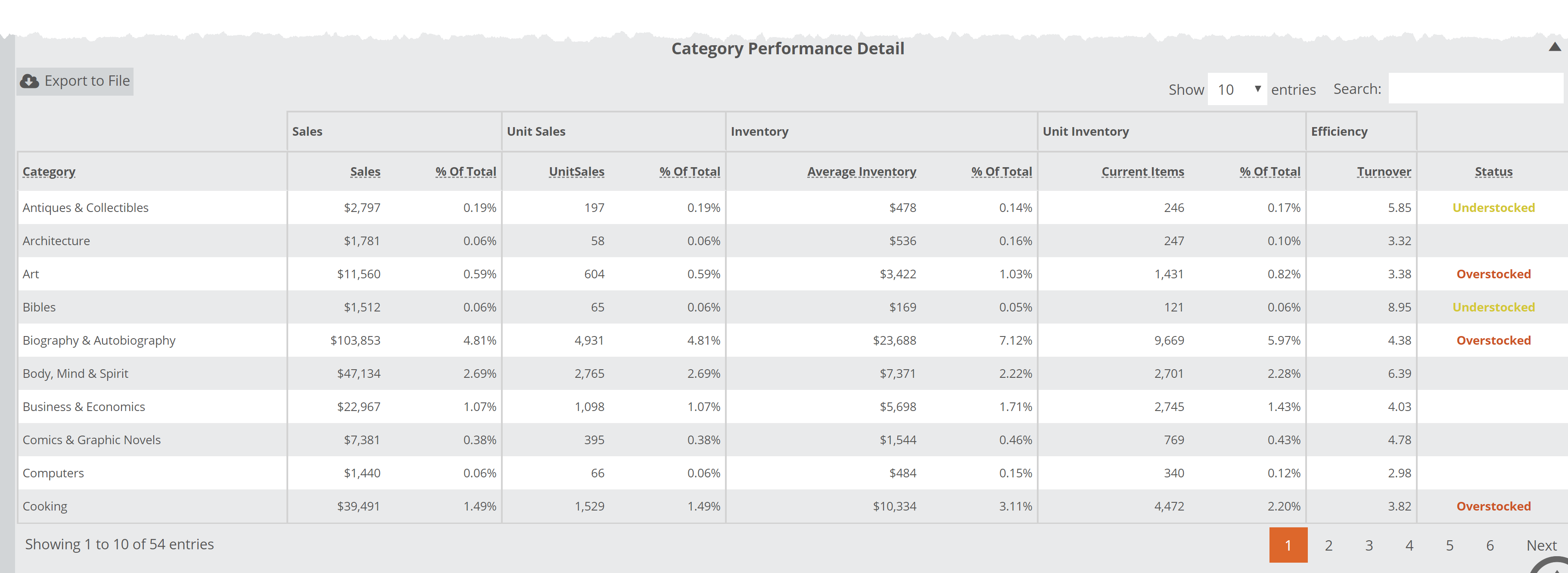
Here’s what each column means:
Category: These are the categories that are represented in the graph, however you’ve chosen to filter and dive in.
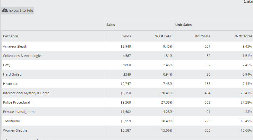
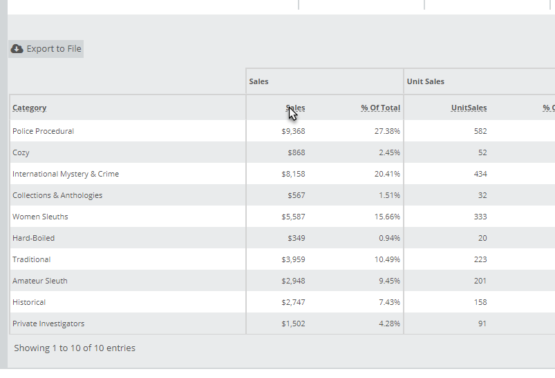
Sales: Total gross $ sales of titles within that category in the specified time frame. In the example above, this store sold $9368 in Police Procedural mystery books in the last year.
% Total: In the example above, all the sub-categories shown in the chart represent all titles at this store that fall under the Mystery classification. So here we can see that Police Procedurals outsell the other mystery genres, accounting for a hefty 27.38% of the total mystery sales.
UnitSales: The actual number of copies sold in the time frame. Police Procedurals sold 582 units.
% of Total: Same as in $ sales.
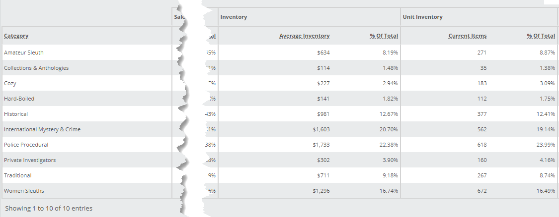
Average Inventory: Gross $ inventory levels, averaged out over the selected time frame. Inventory levels change daily, so an average gives a pretty good view of the usual investment in that category.
% of Total: The percentage of the larger category each of these sub-categories represent. Police Procedurals account for 22.38% of the total investment in Mystery titles. The idea is to compare the % Total Sales number with the % Inventory to make sure your offerings are commensurate with what your customers want. In this case, Police Procedurals represent about 22% of this store’s Mystery titles, and 28% of the Mystery sales. That’s not too shabby.
Current Items: Total number of ‘units’ in stock in a particular category at the moment. In the image above, you can see that this store has 618 Police Procedurals in their inventory.
% of Total: Same basic measurement of % of Total average inventory, simply using number of units rather than a monetary value.
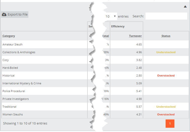
Turnover: Turns are a 12 month calculation, Sales divided by Inventory, and indicates the number of times over the course of a year this category will turnover. The higher the turns, the more profitable that inventory is. To increase turns, you can increase sales or decrease inventory. Often what needs to happen here is a round of somewhat aggressive return pulls and a look at what else sells well that you may be missing.
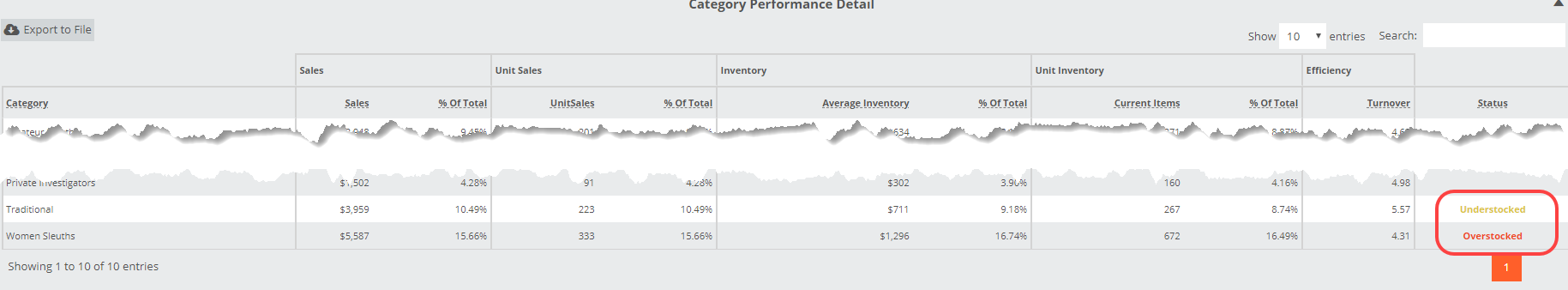
Status: Overstocked, Understocked, or Neutral. The image above shows that Traditional mysteries account for less than 9% of this store’s Mystery titles, but almost 11% of the sales. Once the discrepancy between those two percentages gets big enough, this tool will flag it with an Overstocked or Understocked Status.
Note, you can sort this chart by any of these columns by simply clicking on the column header. It can be convenient to sort the chart to list your categories from highest to lowest sales, etc.