
The Historical Overview lane is really pretty simple, but full of important information:
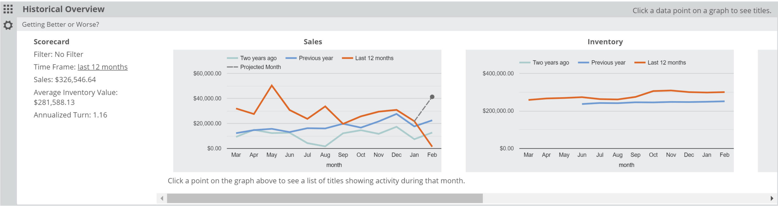
You can quickly see, for your whole store, or for whichever Filter you have set, monthly Sales, Inventory, Turns, and Unit Sales levels for the last few years. As the labels on the graph indicates, the red line represents the last 12 months, the dark blue line represents the 12 months previous, and the light blue line represents sales data from 2 years ago. Assuming we have that amount of data from your store(s), you’ll see at a glance how all, or a specific portion of your inventory, has been performing for the last few years. Whether for budgeting purposes, program or display planning, etc. this information can be crucial.
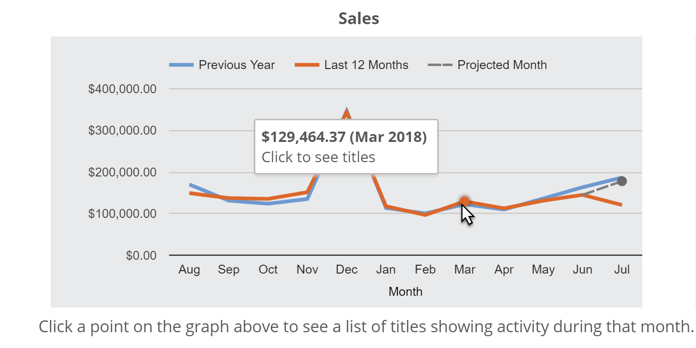
Hover over a spot on the graph to get the total activity of that month:
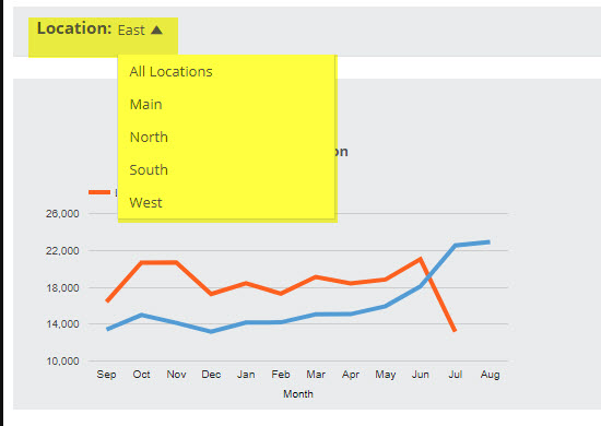
You can view specific locations using the Location Selector at the top of your Analytics page:

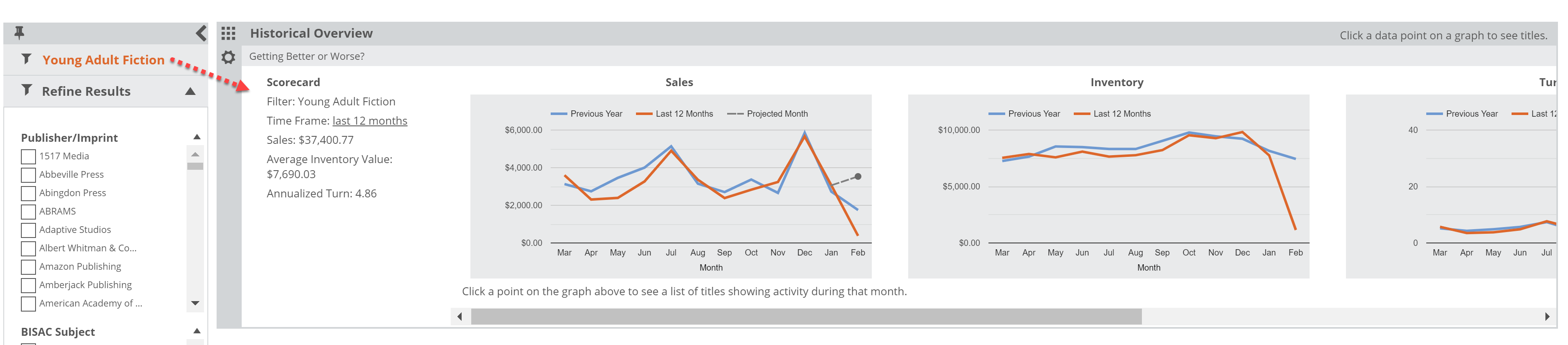
And as mentioned above, your Saved Filters will customize your Historical Overview graphs. For example, you can see how sales, stock, and turns have trended for Young Adult Fiction over the last couple of years:
Click any month to get a list of relevant titles for that month’s activity. For example, click to see which specific titles sold in December, along with all the rich market and title data for those titles:
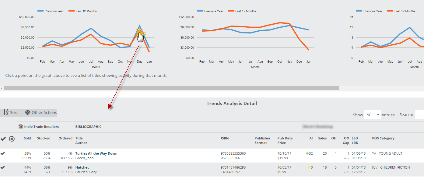
You’ll see graphs for Inventory (average gross), Sales (total gross), Turns (Sales/Inventory), Share of Total Store, and Unit Sales (total number of items sold per month).
The Share of Total Store graph is a pretty useful tool that displays the % of Total Sales and Total Average Inventory represented by a category or section. This is dependent on you selecting a Saved Filter or a Refinement from the left hand menu. If you do not have any sort of filter set, you’re looking at your entire inventory, and so your share of total store would be 100%. For example, though, looking at this sample store’s Fiction category shows that their Sales % is much higher than their Inventory %, which is a characteristic of a strong and healthy category. (This dynamic is more obtusely represented by the Turns number as well.)
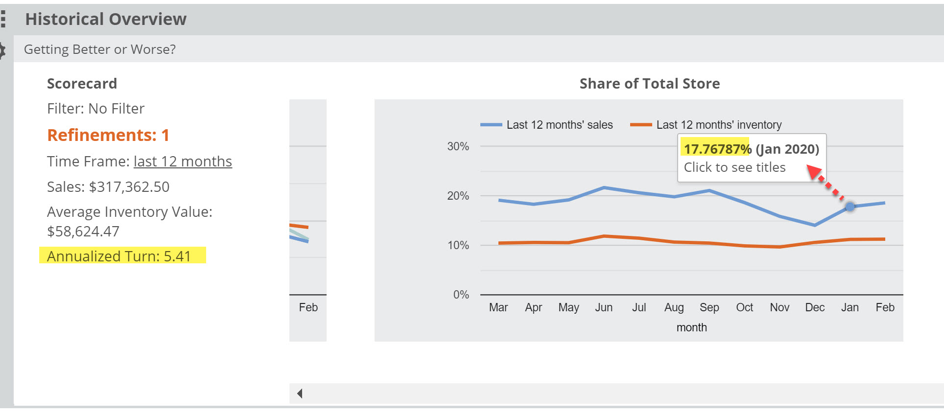
Hover or click on a spot in either line to see that percentage. So in this case, this store’s January fiction sales represented 17.8 % of the total store sales. The average inventory was only 11% of the total store. You’re working hard, Fiction!
