
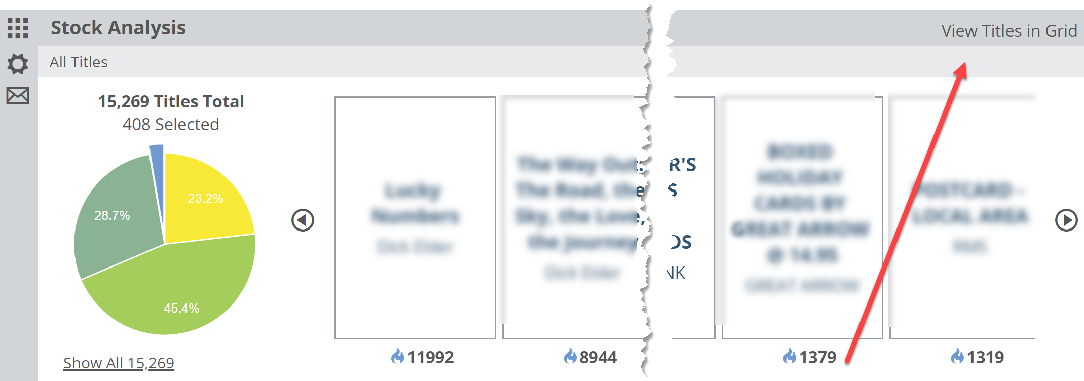
The Stock Analysis graph is designed to show you the chunk of your shop that you’ve selected (between your parameters and Saved Filters) and then show you how that selection of titles (or your entire inventory) is performing in your shop.

The performance measurements are based on Shelf Days details of which you can find here.
This graph will most often be used to find those titles with which your shop is doing the best and the ‘worst.’ The Best titles would be those that you’re selling at a brisk and profitable pace. The Worst performers are simply the titles that are not selling, and have not sold in quite some time. This measurement can be a great way to gauge the relative health of your stock, or even just a portion of it.
Note that Shelf Days tends to give more weight to titles of which you own multiple copies. So a stack of 12 copies of a title should sell pretty quickly to justify that expenditure.
So, to see those titles that could likely go away without your customers even noticing, as sad as that may be, click in to that Cool/Stale (bright blue) portion of the graph. From there you can scroll through those titles or, more helpfully, click in to the Title Detail list.
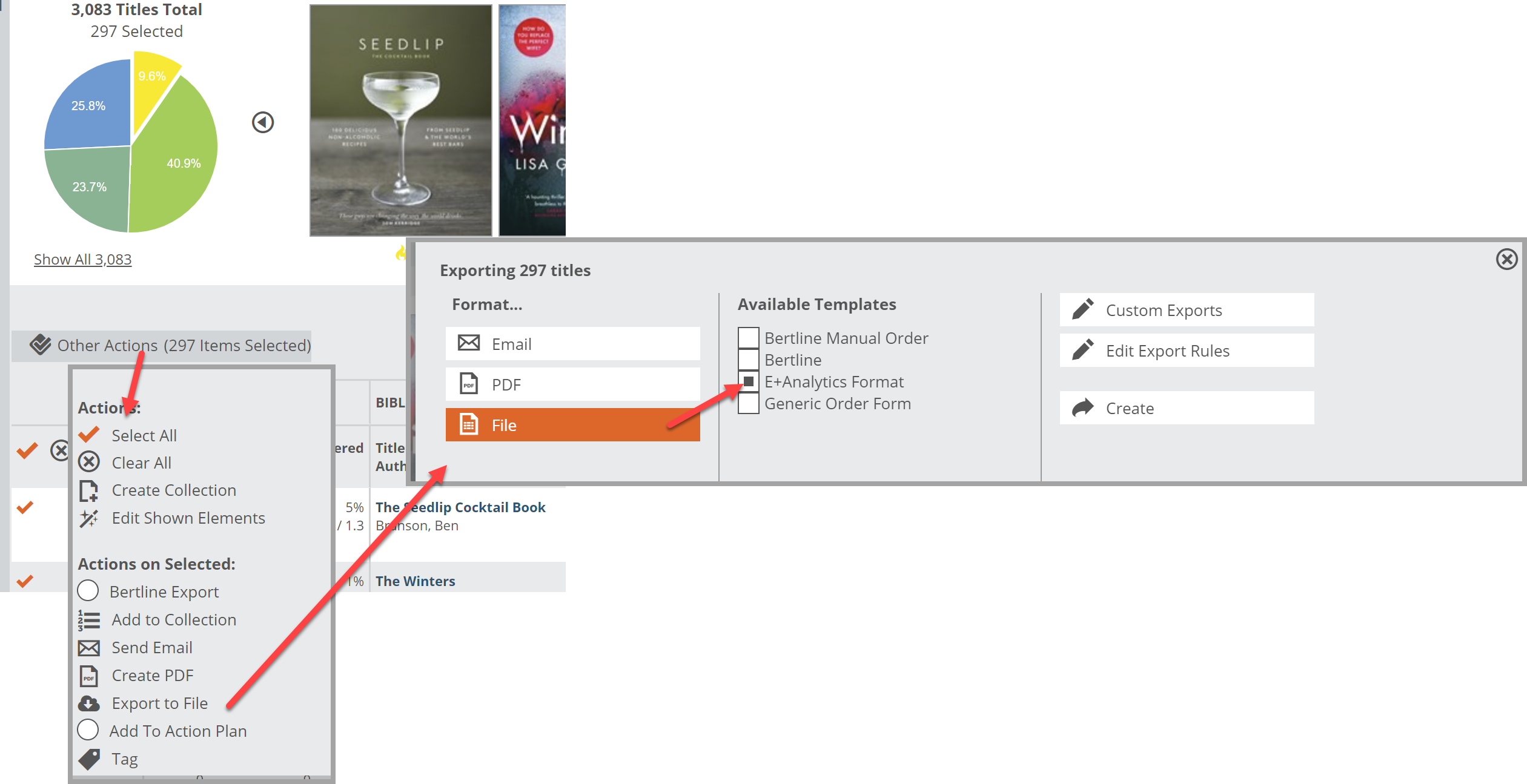
 From that list, you can create spreadsheet you can use to create a return pull list.
You can, and probably should, also use this information to see which titles really do the best in your shop. You likely have a good idea, but it’s nice to have a precise idea. This helps you buy more intelligently for your shop and for your customers. Indeed, having the titles that your customers want is sort of the point of it all. Having titles they will want…they just don’t know it yet… is sort of the point too, of course. Such an endeavor is both noble and fraught with missteps. Reacting to those missteps to clear them out and fill that shelf space with something new is good business.