The Location Performance Comparison lane gives you the chance to compare your locations’ performance against each other. The basic concept is really the same as the Category Performance Comparison lane, just looking through more of a ‘macro’ sort of lens.
The most likely scenario here is to use a Saved Filter to compare different portions of your inventory in your different shops. For example, which shop has the best turns for kids books?
You can create filters using your own POS categories as well as a wide range of options for combined filters (Example: kids science board books published by HarperCollins between 2011 and 2013).
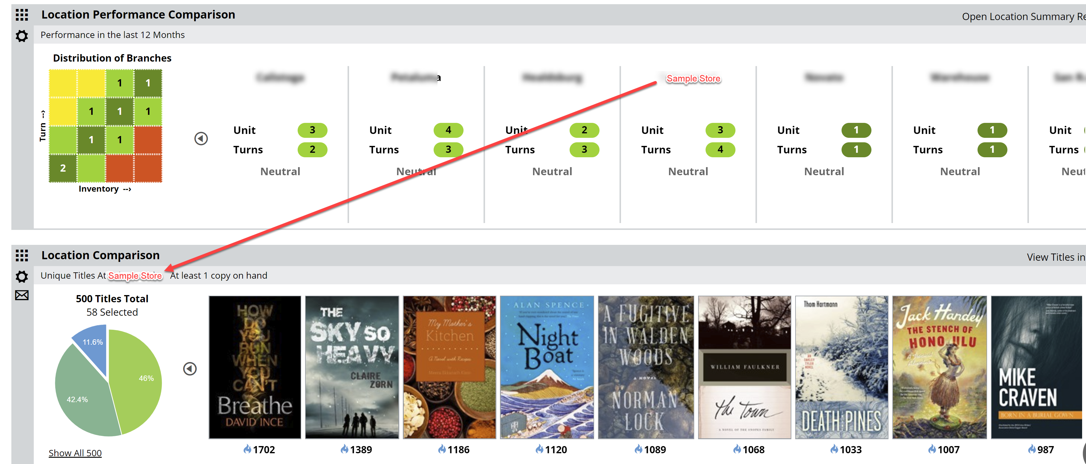
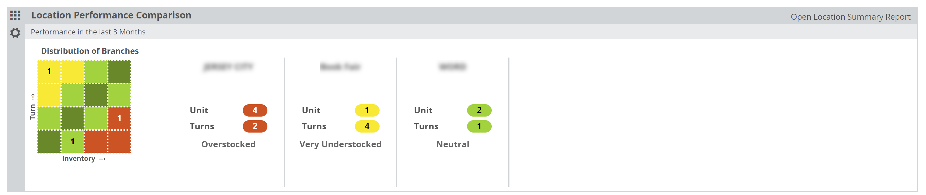
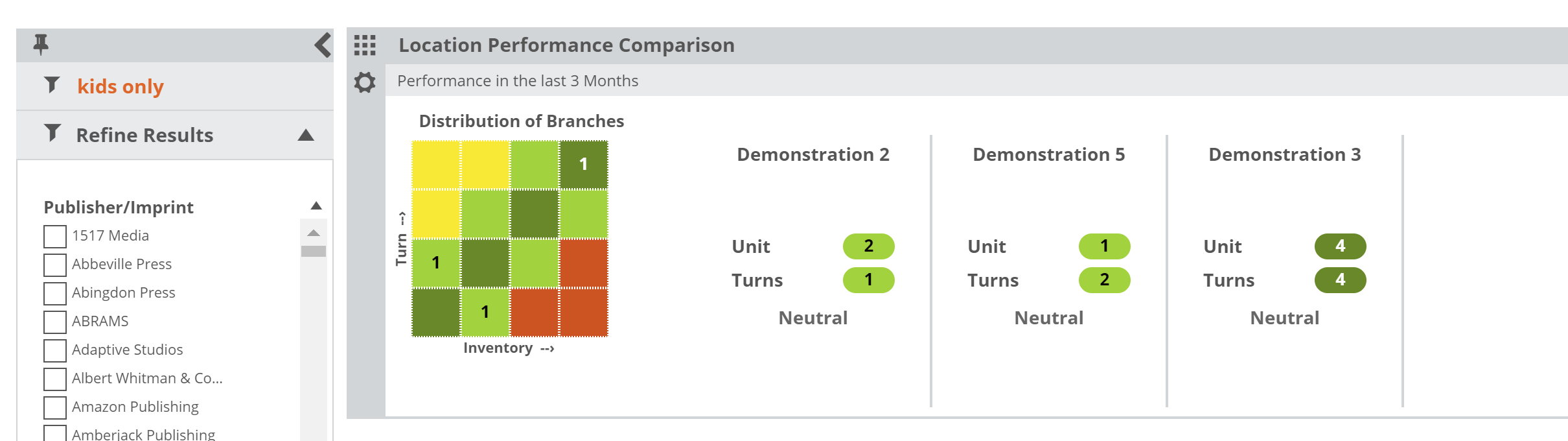
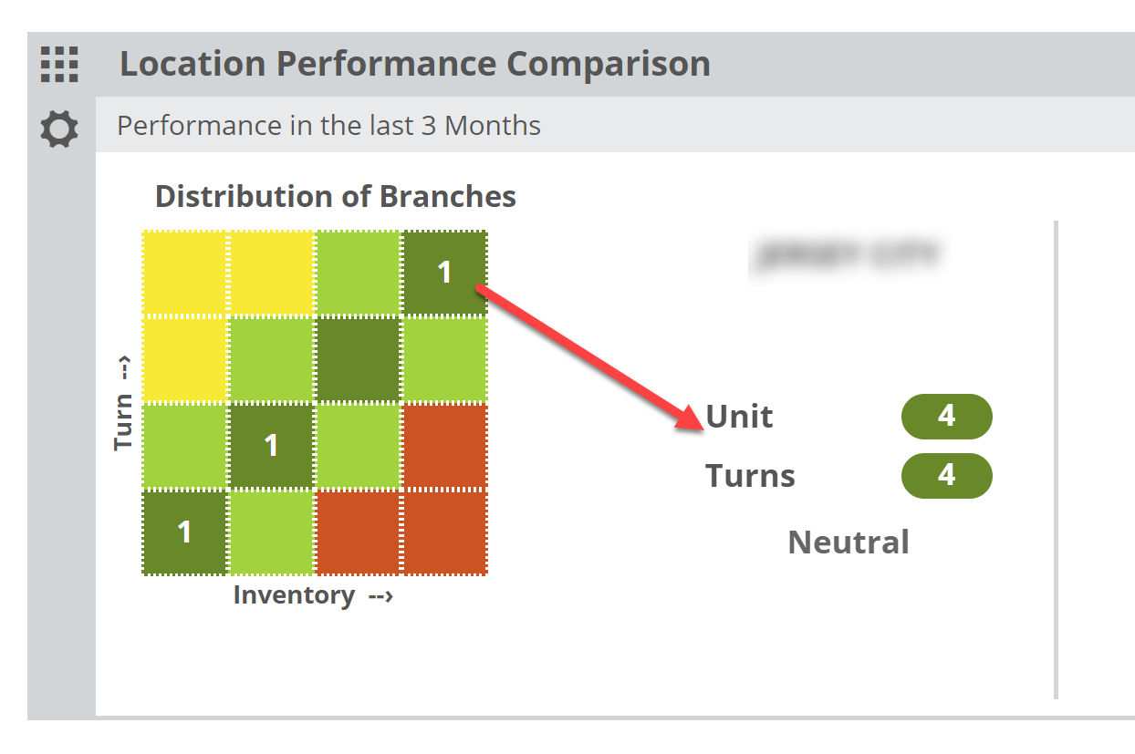
In the graph, each of your locations is represented within one of the quadrants. If more than one location land in the same quadrant, you’ll see a 2. This simply indicates the number of locations that qualify for that quadrant based on their inventory and turn levels. Keep in mind that placement here is relative, so each store is measured and placed according to their own results in comparison with the other stores’ results.
The horizontal axis represents inventory in total number of units (copies) owned. The larger the holding, the farther to the right a branch will show.
The vertical axis represents “Turns.” Sales vs. Inventory. The higher the Turns number, the higher on the grid that location will land. A location in the upper right, dark green quadrant would be one that is larger than the other stores with better turns. A store in the lower left would be relatively smaller than your other stores with the lowest turns.
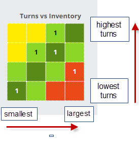
You can click on number to see which stores land in that quadrant:
Or you can view all your stores without clicking through (especially if you only have a few locations):
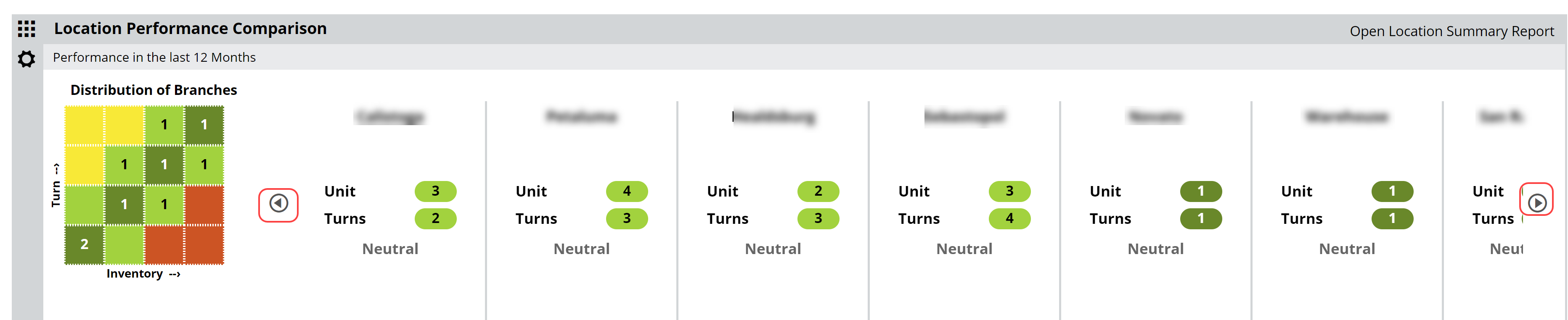
The color-coding is consistent between the graph and its details. Within those details, the numbers shown under each shop indicate where on the ‘heatmap’ graph this shop lands. If it helps, you can think of it like the board game “Battleship.” Under “Main” you can see that the Unit number is 4, indicating it lands in the 4th column over, and the Turns number is 1, indicating that it landed in 1st row up. This is more to convey a visual representation of the relative size and performance of each of your shops. To see more specific details, click “Open Location Summary Report” in the upper right corner of this lane:
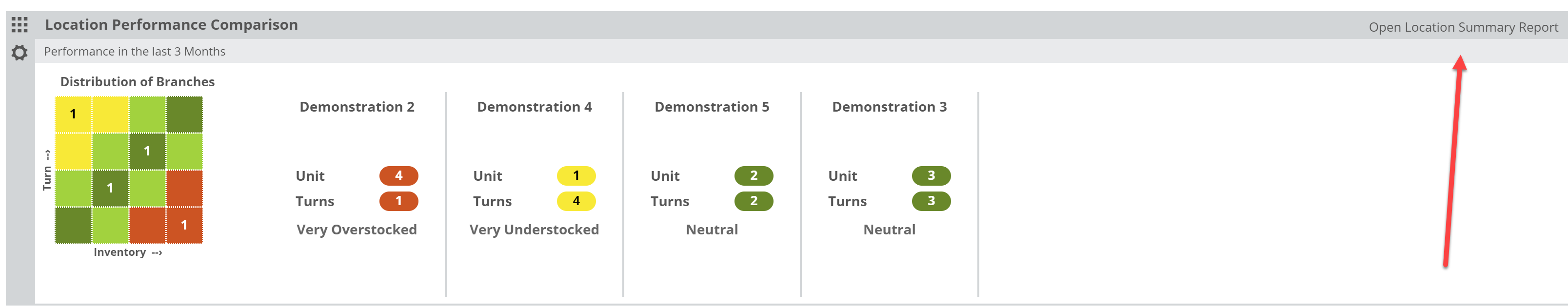
There, you’ll see the numbers that prompted the placement of these locations on the graph.
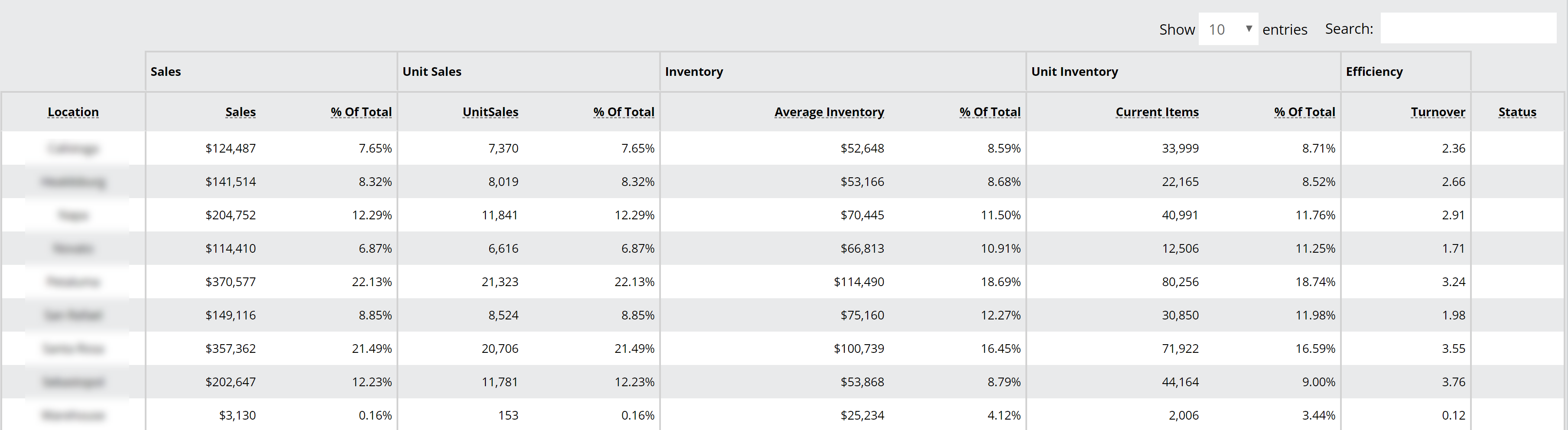
Using this information, it can be clear which stores could use an influx of books, and which could stand to lose a few.
Helpfully, you can click on a store within the graph’s details, which will update the comparison location in your Location Comparison lane. This facilitates the discovery of likely transferable titles.